Icon
Full Logo
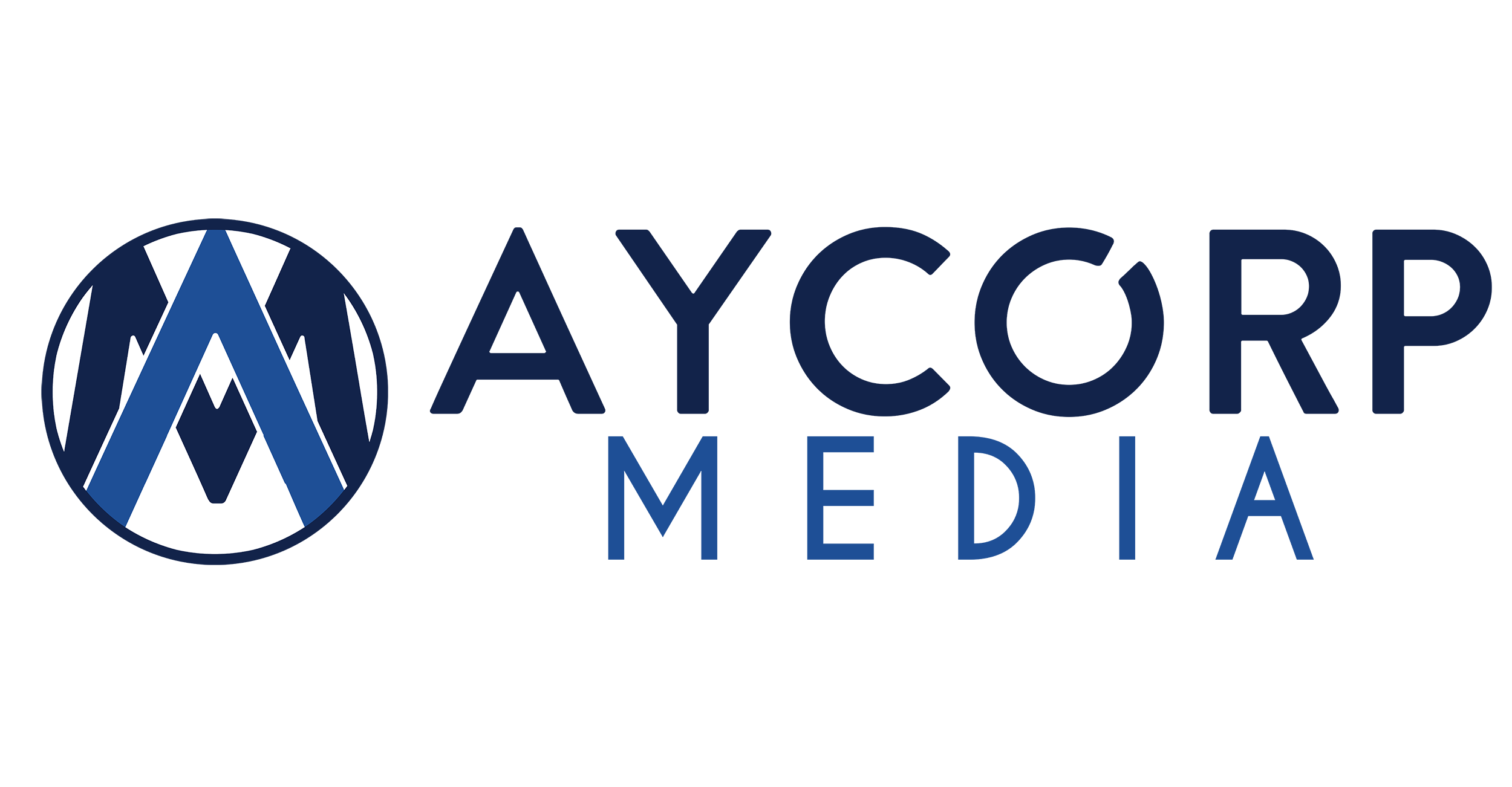
Aycorp UP Brand
This design is heavily influenced by the current/temporary LEAF design.
My main objective behind this design was to stick with simplicity, while still incorporating meaningful elements. Whereas the leaf in the LEAF brand was intended to imply new growth as in the growth of the different business operations under the Aycorp portfolio, the arrow in the UP brand intends on capturing that same emphasis on positive, upward growth across all operations. Similar to logos such as FedEx and USA Network, I worked to utilize the negative space with a meaningful design.
Icon
Full Logo
Aycorp Widget Brand
This design is more of a “from scratch” different approach.
Taking inspiration from logos I have designed in the past, this logo completely separates the widget or icon section of the logo from the wordmark. A positive feature of this logo concept is the ability to switch the colors around but keeping the same base design. As you’ll see below, I’ve included several other color layouts just to provide an idea of what we can accomplish. This will give you a view of several different looks before making a final decision. Like the UP brand, the widget clearly gives the impression of upward growth and positive energy associated with all brands under the Aycorp portfolio.


Icon
Full Logo
Aycorp Point Brand
This design is another “from scratch” with more of an emphasis on the icon’s reflection of the wordmark font.
Again, this logo separates the widget or icon section of the logo from the wordmark. This logo concept also offers the ability to switch the colors around, while keeping the same base design. Below are several other color layouts to provide an idea of what we can accomplish with minor color changes. Like both prior logos, the point brand gives the impression of upward growth and positive energy associated with all brands under the Aycorp portfolio, only this icon is more reflective of the associated font.


Icon
Full Logo
Aycorp Dot Brand
This design is another “from scratch” with more of an emphasis on the icon’s reflection of the wordmark font.
Again, this logo separates the widget or icon section of the logo from the wordmark. This logo concept also offers the ability to switch the colors around, while keeping the same base design. Below are several other color layouts to provide an idea of what we can accomplish with minor color changes. Like both prior logos, the point brand gives the impression of upward growth and positive energy associated with all brands under the Aycorp portfolio, only this icon is more reflective of the associated font.

Additional Concepts
Additional conceptual designs for consideration.